UI/UX Case Study · 2025
Banq — Campus Canteen Food Ordering & Seat Reservation App
Banq is a real-time food pre-ordering and seat reservation app designed to cut long queues at university cafeterias. This UI/UX case study covers the research, goals, user flow, and design system behind the KantinUbhara prototype for Universitas Bhayangkara Jakarta Raya.
- UI/UX Design
- Product Design
- Visual Identity
Overview
Banq is a real-time food ordering and seat reservation app designed for university cafeterias, built as a design case study for KantinUbhara, the canteen at Universitas Bhayangkara Jakarta Raya. Created for a Developer Student Clubs (DSC) challenge by team Stop Kontak, the project explores how a mobile-first ordering experience can help students order ahead, pick a seat, and skip the line entirely — turning a chaotic lunch rush into a calmer, more predictable routine.
The Challenge
Long queues aren’t just a minor annoyance for Indonesian university students — they shape where, and whether, people eat on campus at all.
More than 66% of Indonesian university students are dissatisfied with their campus cafeteria services, and 69% choose to eat off-campus at least once a week.
That dissatisfaction pushes students toward pricier, less convenient options off-campus, while canteens lose customers and over- or under-prepare food with no visibility into real demand. At the same time, the opportunity was clear: research on restaurant pre-ordering systems suggested queues could shrink by up to 30% and food waste by 15%, and 85% of Indonesian youth already use smartphones daily, spending 90% of their mobile time inside apps — the audience was ready, and the behavior already existed.
The brief also carried a distinctly local wrinkle: Indonesian campus canteens are often split between areas where smoking is allowed and areas where it isn’t, and existing systems gave students no way to plan around that before they arrived.
Goals
- Reduce queues & wait times — pre-ordering and real-time status notifications speed up the entire dining process.
- Simplify zone & seat selection — smoking and non-smoking areas, with live seat availability.
- Enhance comfort & satisfaction — a seamless, organized experience tailored to student preferences.
- Support campus digitalization — bring tech-driven ordering to a traditionally manual system.
- Minimize food waste — help vendors forecast order volume and inventory more accurately.
Design Process
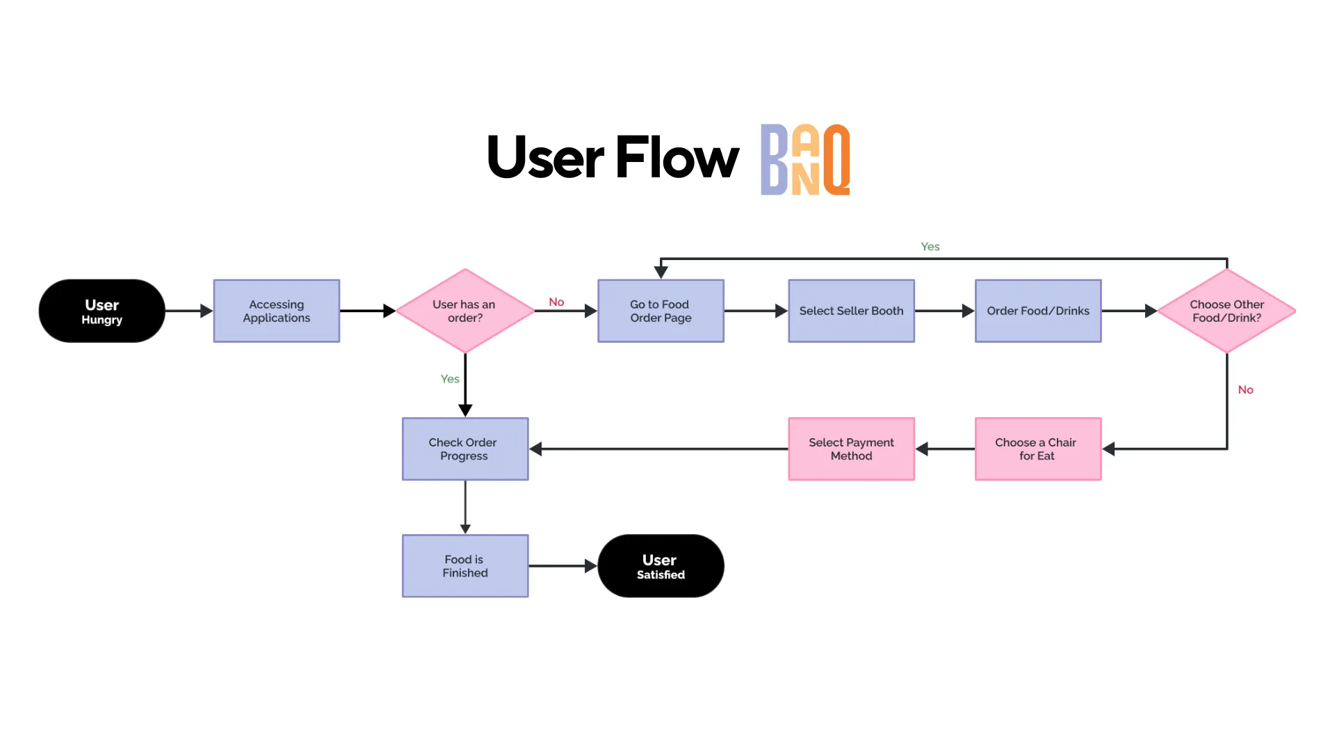
Mapping the user flow
The core flow starts from one simple branch: is the student hungry, and do they already have an order? From there, two clear paths emerge:
- New order — open the app → go to the food order page → select a seller booth → order food or drinks → choose a chair/table → select a payment method → track order progress.
- Existing order — skip straight to checking order progress, so returning users aren’t forced through the ordering flow again.
Designing it this way meant the “check status” path had to be just as fast and visible as the ordering path itself — for many students, refreshing an order-status screen is the primary use case during a busy lunch period.
Solving for smoking vs. non-smoking areas
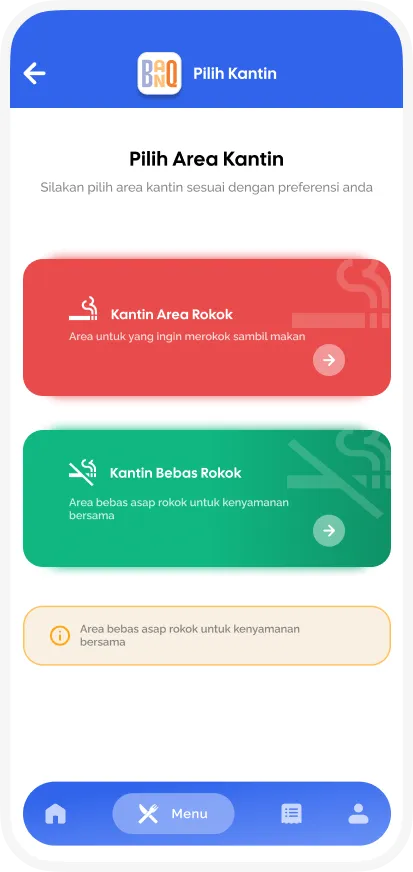
Rather than bury the smoking/non-smoking choice inside a filter, it became a first-class step in onboarding and ordering: Kantin Area Rokok (smoking area) and Kantin Bebas Rokok (smoke-free area) are presented as two distinct, color-coded entry points — red for the smoking area, green for the smoke-free one — with a note clarifying that menu and drinks are available in both. This turned a logistical constraint into part of the app’s identity rather than an afterthought.
Design system & visual identity
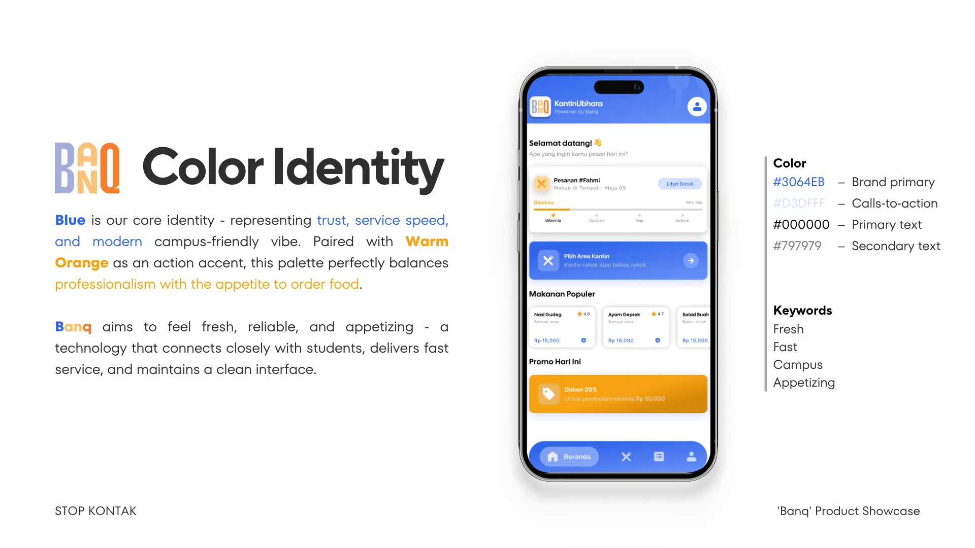
The visual language was built around Inter as the sole typeface, with a clear type scale (H1 32px Bold down to a 12px caption) so both dense menu screens and simple order-status screens stay readable.
Color went through two passes. The first design-system pass defined a functional palette (brand primary #2B8FD6, CTA orange #C84A20, secondary CTA #0B66D1) alongside dedicated success, warning, and error states. That was later refined into a simpler, punchier identity for the final mockups:
- Blue
#3064EBas the brand primary — chosen to represent trust, service speed, and a modern campus-friendly feel. - Warm orange as the CTA accent — chosen to signal appetite and urgency against the cooler blue.
- Supporting neutrals:
#000000for primary text,#797979for secondary text.
The guiding keywords for the identity were Fresh, Fast, Campus, Appetizing — every screen was checked against whether it still felt quick and appetizing rather than clinical.
Key screens
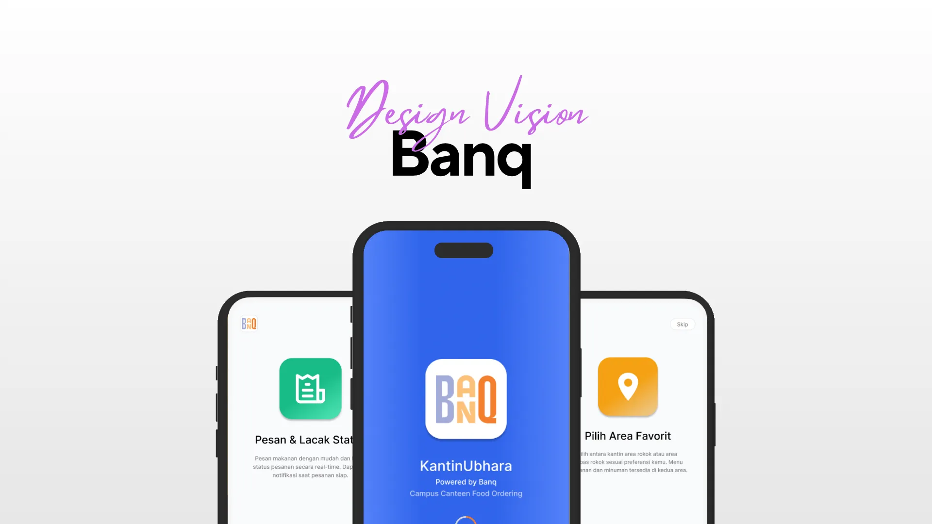
- Onboarding introduces the two core promises up front: ordering with real-time status tracking, and choosing a favorite area before arriving.
- Login / Register (
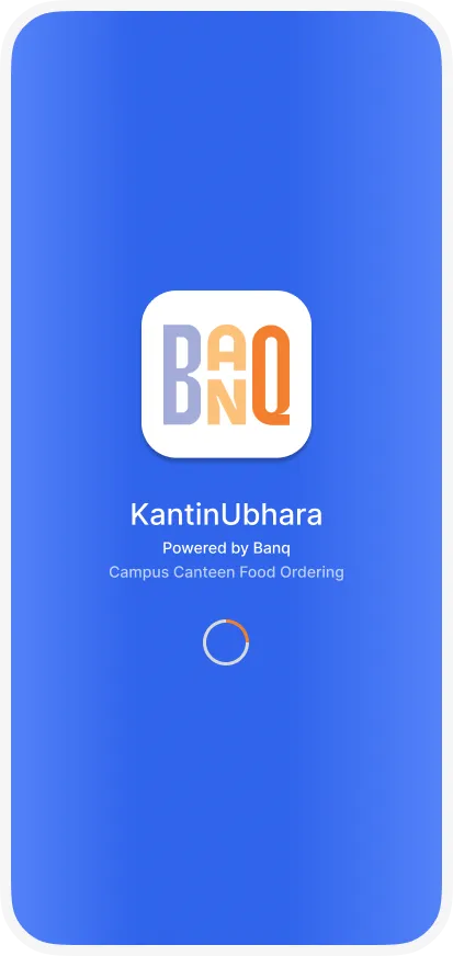
Masuk/Daftar Sekarang) keeps the “KantinUbhara — Powered by Banq” branding front and center as a trust signal for a campus-specific tool. - Area selection presents the smoking/non-smoking choice as a full-screen decision, not a buried toggle.
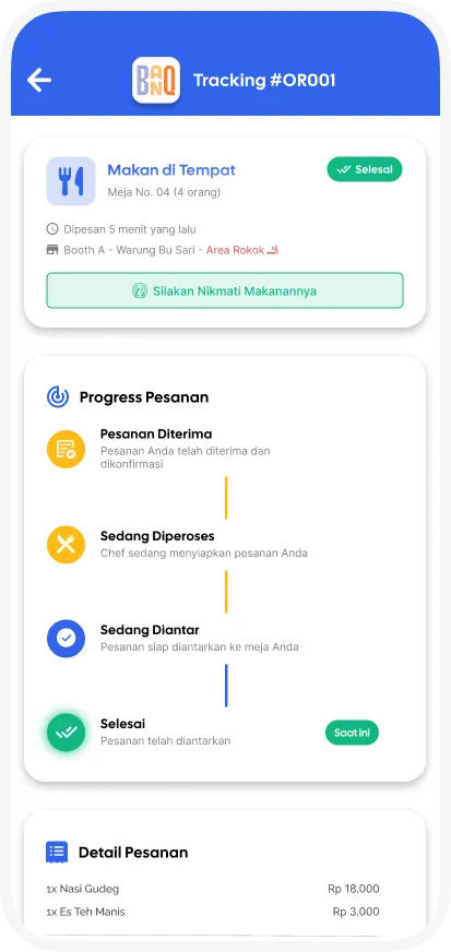
- Order status separates active orders from history, showing a live itemized breakdown (items, price, total, and an estimated wait time) so students know exactly when to head to the counter.
- Home surfaces the current order-status card, a shortcut back into area selection, a “Makanan Populer” (popular items) rail with ratings, and a promo banner — designed to give returning users something useful within the first screen, not just a menu dump.
Impact & Learnings
Banq was designed and prototyped as a research-backed concept rather than a deployed product, so its impact is best framed as a hypothesis grounded in existing data rather than measured results: if the queue- and waste-reduction figures from prior pre-ordering research hold, the app’s five goals — faster service, simpler zone selection, better comfort, digitalized operations, and less food waste — follow directly from solving the ordering and seating bottleneck.
The biggest design lesson was how much a single local constraint — smoking vs. non-smoking seating — could shape an entire information architecture. Treating it as a first-class step, rather than a settings toggle, made the app feel built for this specific campus rather than a generic food-ordering template. It’s a reminder that the most distinctive detail uncovered in research is often worth designing the whole flow around, not just adding as a filter.
Design Process Gallery